Can Type Bring an Organization Together?
Our Weill Cornell Medicine work just won a GDUSA Design Award—read how typography played a key role in reimagining the system
Typography, even in the midst of massive changes, still remains an invaluable element in helping marketers tell their brands’ stories.
In our recent work with Weill Cornell Medicine, which won a 2016 Graphic Design USA Design Award, we developed a custom type system that served as a crucial element of the new brand. We spoke with the creative team who built the system to talk more about why it works, the elements behind it, and how other marketers should think about evaluating their own systems.
Take us through a bit of background on the project.
Well, Weill Cornell Medicine is a real New York institution. It’s a healthcare organization (and network of partners) that has been around for more than 100 years, combining education, research, and patient care.
But for a long time, its brand story had largely focused on only one of those three ideas: Weill as an academic institution. And as it grew across New York and beyond—and continued to show that it had world-class strength in research, patient care, and education—the brand needed to evolve.
We set out to build a system that helped tell a new story that focused less academic, and more focused on patient care. Our typography system was a huge part of it.
How did custom typography come up?
It’s important to realize that creating a custom typeface—or just changing for the sake of changing—is not always the answer.
We thought about what we wanted the new brand to communicate, and realized a few things. First, that medicine really is a unique space: whether you’re dealing with patients, students, doctors, or donors, it’s always going to be highly-charged and emotional. Your audience is looking carefully at every communication, from an eye chart on the wall to a prescription form, with care and attention.
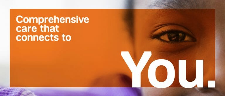
And when that’s the case, type really has a chance to make a difference and impact their experience. Again, for Weill, we wanted to show that the institution wasn’t too clinical or rigid; instead, it was warm, collaborative, and optimistic. The curved letterforms, the weight, the distance between each character—all of those elements started to give people a real sense of that.
Can you take us through some of the details of the typeface?
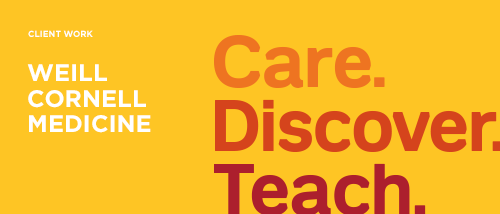
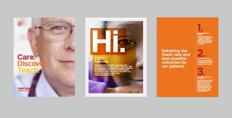
Sure. To drill down a little more on what’s above, we focused on making soft edges for each letterform. We wanted it to feel approachable. Its beveled forms are distinct, and its combinations of red and orange are meant to give it a friendly, human attitude.
We also wanted to make sure that it lived within the larger Weill system we were creating. In healthcare, you’ll often see a lot of complexity in brand identities: the organizations have a lot of different affiliations, and many of these divisions have legacy graphic elements—things like seals, or even their own identities.
Our solve was to give each letter a high “X” height and bold letterforms, which let the type actually work within the Weill Cornell Medicine seal and stand out in the larger peer landscape. We knew the system needed to be flexible enough to work across a range of communications, so we built the word mark with a dynamic configuration that can work with 1-, 2-, or 3-line forms.
And finally, we wanted the type to be memorable with the internal Weill Cornell Medicine team who would be using it—so we gave it the name “1898 Sans,” after the year that the organization was founded. It’s a final touch that reflects all of the unique characteristics Weill brings to each interaction with a patient, doctor, donor, or another stakeholder.
You mentioned that it’s a Sans Serif—can you explain more about that decision?
It wasn’t a mandate from anyone, but if the whole point was to move from academic to modern and human, a Serif font felt too academic and rigid.
We knew the type would have to work hard across a range of communications—from high-level promotional communications to very tactical, hard-working ones like patient intake forms. Sans serif worked really well for the challenge.
See more of our work for Weill Cornell Medicine here.