/ Brown University
Brown University Needed a Giving Experience that Lives Up to its Ethos
WHAT WE DID
Naming
Visual design
UX design
Front-end web development
On the heels of launching Brown/Together, Brown University needed a website as unified as the campaign.
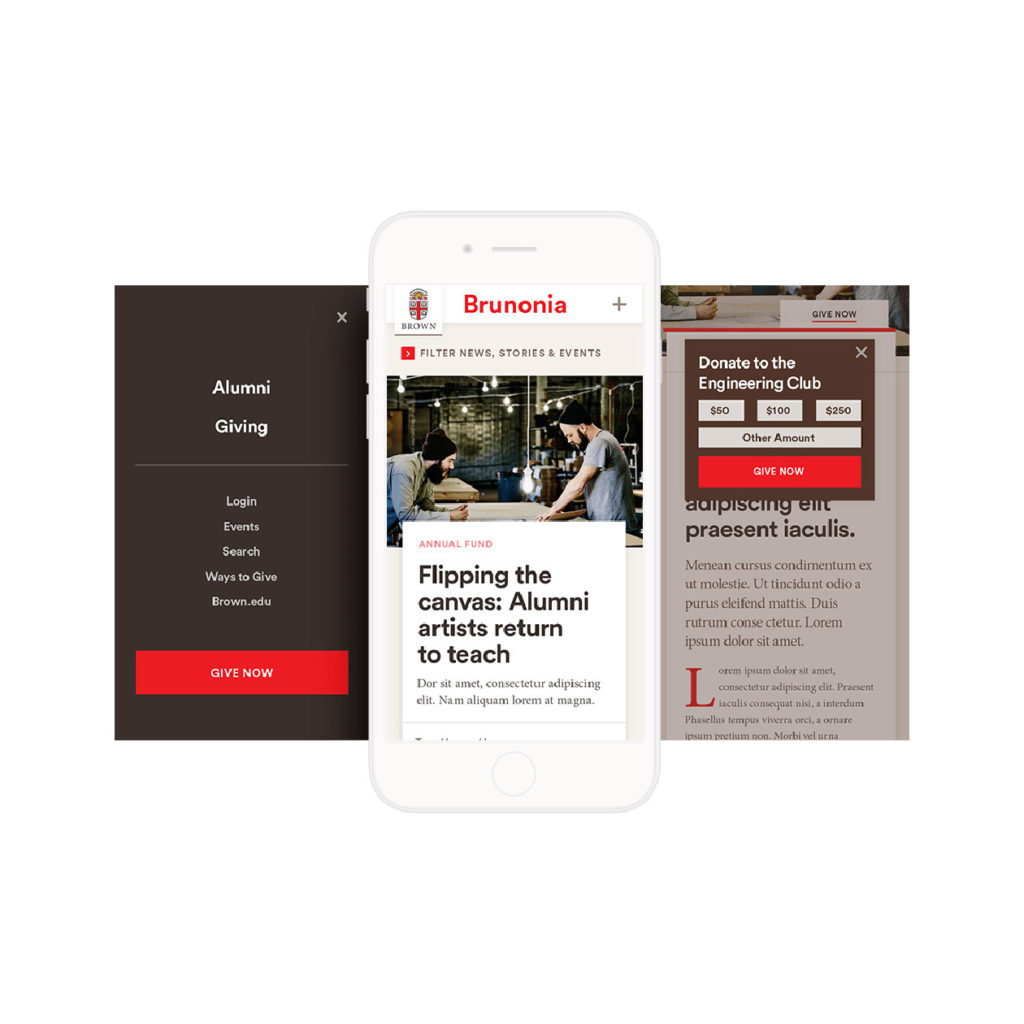
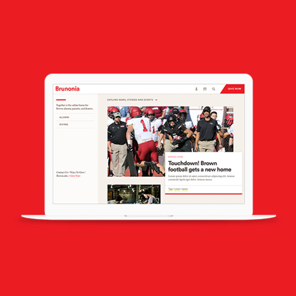
In 2015, Sullivan branded and launched Brown/Together, a $3 billion capital campaign. But when alumni went online to engage with Brown, they faced a fractured experience spread across 13 advancement portals, each devoted to a different priority. Brown needed a single place for alumni, parents, and donors to be inspired by Brown’s vision and to support the Brown experience. Sullivan reimagined what giving to Brown would look like, building a new digital hub that enabled a user experience as unique as a Brown education.
WHAT WE DID
Naming
Visual design
UX design
Front-end web development
Using an agile methodology with a dispersed team for a more nimble, efficient website build.
The portal was built as a single page application using VUE.js and connected to Drupal as a content repository.
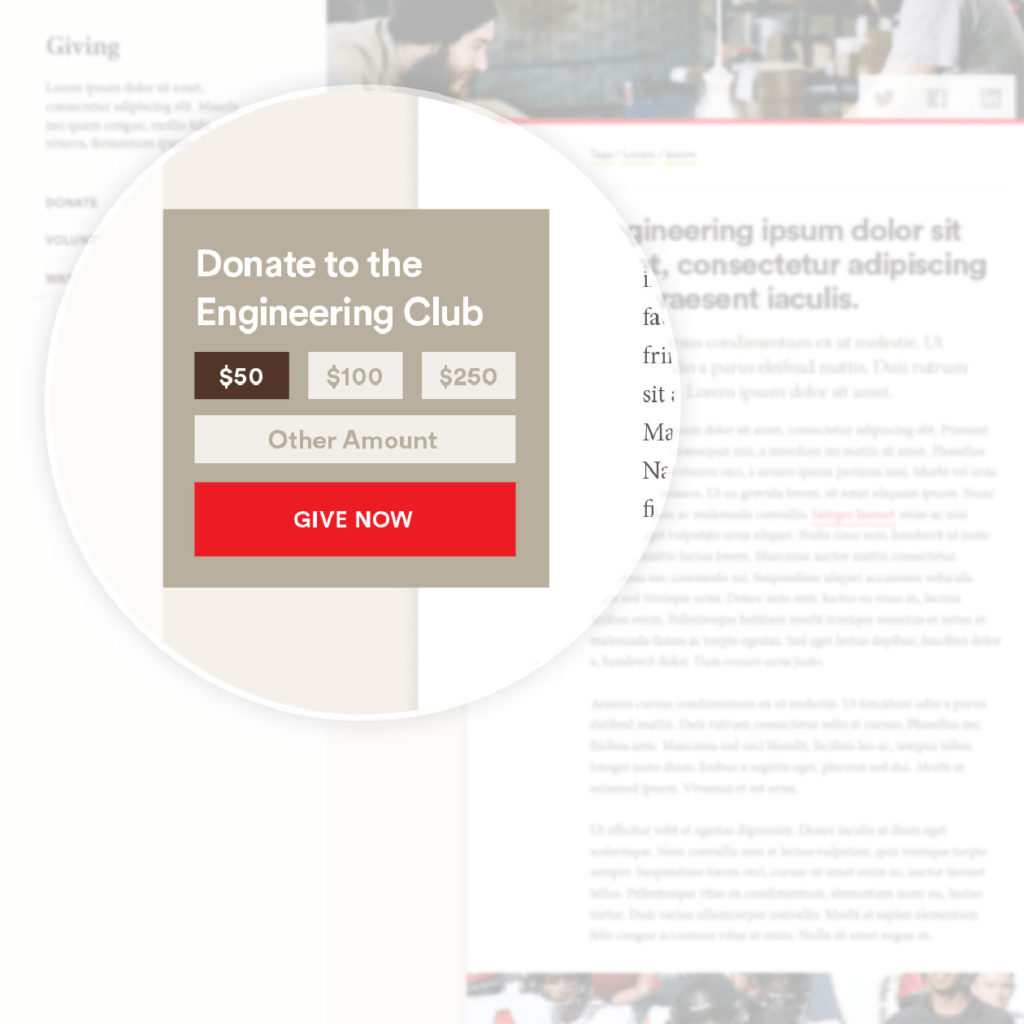
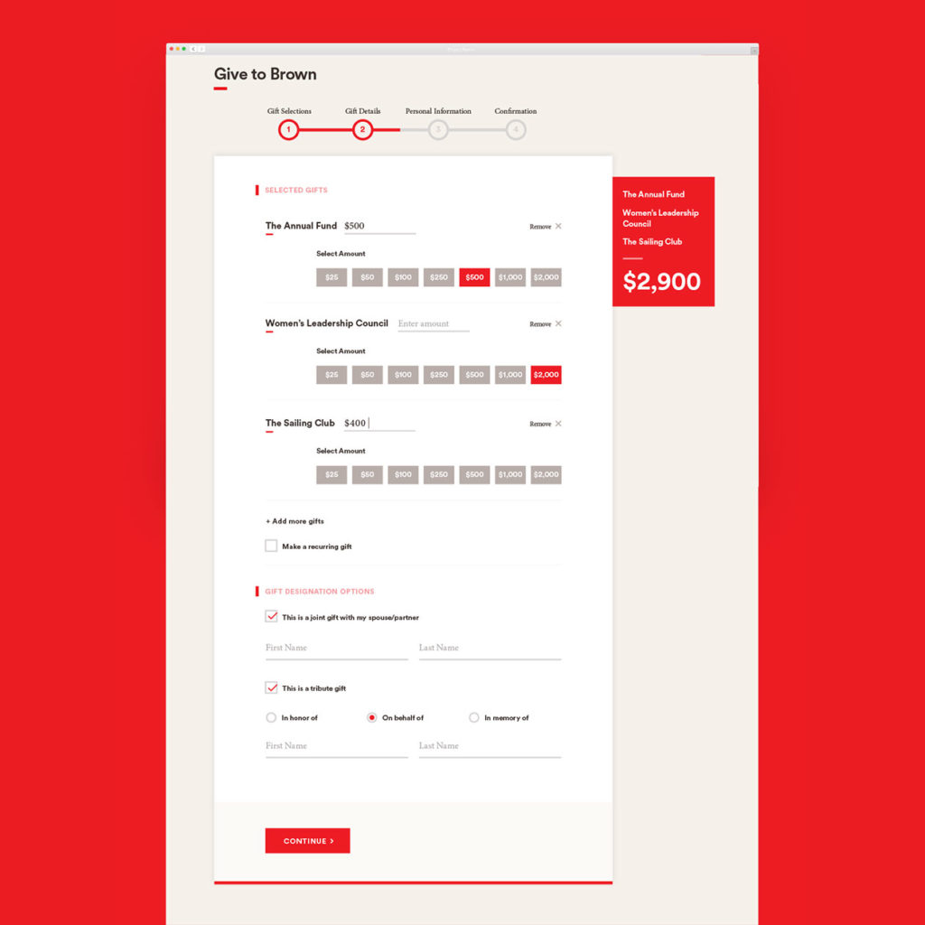
A redesigned giving form that prioritizes the why over the how much.

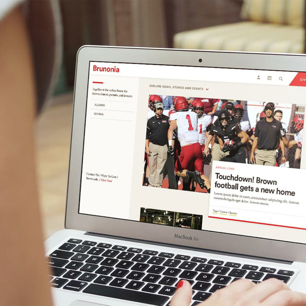
Responsive design to ensure giving is simple any time, on any device.
We couldn't be more excited. It's truly been a labor of love and we couldn't have done it without you.
Senior Marketers
Brown University
